Area light fix (light, not shadow!)
Posted in Development by TonWhile sipping from an excellent cup of coffee I’ve worked on the area lamp render fix, as promised to work on in exchange for the incredible espresso engine!
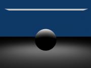
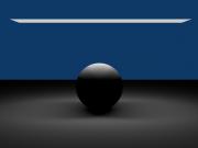
The above images show the old situation, with and without shadow. Note that the light doesn’t really make the sides of the sphere become lit, and for shadow this even becomes totally terminated.
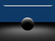
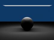
This is the situation as now in svn. Now, for every possible shadow sample, an area light calculation is done from that position. This clearly gives much nicer light on the sphere (but note that the floor is identical). With a shadow render, the self-shadowing effect of faces are visible. I’ve not included terminator code for resolving phong imperfections… that fights with the whole idea of soft shadow. Better to use as small faces as possible now.
(More work on this will be done of course, this is the first commit, need to do more tests for quality)
Grazie mille!
-Ton-


December 1st, 2007 at 8:03 pm
thanks ton, it seems it’s working better now, but maybe a bigger area light would show better the difference.
don’t drink all the coffee in one week!
December 1st, 2007 at 8:14 pm
Already fixed!!! That’s what I call fast!
Looks allot better now!
Thanks espresso machine! …Oh!! And Ton ;)
December 1st, 2007 at 10:05 pm
What? You fixed the light already? You are definitely “the man”!
December 2nd, 2007 at 12:57 pm
Just wondering what it would take to bribe you into coding a system similar to the Maya ncloth nucleous?
Just kidding, great work every little bit really makes blender that much stronger. Thanks Ton. and thanks to the Italian community for the gift for the crew.
December 2nd, 2007 at 1:36 pm
Thanks Ton,this means no more banding artifacts in my renders,finally!
December 6th, 2007 at 5:56 pm
I don’t see a difference. Is my gamma set to low? The sphere’s look identical.
December 7th, 2007 at 11:53 am
With such a small area light, the effect may be very subtle on some screens, but if you open the images at full size, you will see that in the first image the ball is not lit below the horizon, while in the third one it is.
December 7th, 2007 at 11:54 am
@Bart Robinson
With such a small area, the effect may be very subtle on some screens, but if you open the images at full size, you will see that in the first image the ball is not lit below the horizon, while in the third one it is.
December 14th, 2007 at 12:48 pm
i’ve tested the new area light here
http://www.kino3d.com/forum/viewtopic.php?t=6224
August 12th, 2009 at 6:17 pm
this site is wonder full ultimate sir very nice kepit up